News
New Exact Online design prioritises user experience and convenience

Yael Shpak, UX Manager: “Increased productivity and satisfied users, that’s what we’re all about.”
Good software can be used without extensive training. It guides users smoothly through their tasks. For that to be possible, you need a design that is intuitive, easy to comprehend and that looks good, too. As User Experience Design Manager, Yael Shpak heads the team responsible for constantly improving users’ experience of Exact business software. In this article, she talks about Exact Online’s new interface; the new design of the software. She explains why the software’s look & feel have changed, how her team made it happen and the benefits to users.
“For me, User Experience (UX) was love at first sight”, says Yael enthusiastically when asked how she ended up in this field. "It combines two great interests of mine: aesthetics and problem solving. I enjoy thinking about design and I find helping people enthralling. My team and I are constantly investigating areas for improvement and innovation in Exact’s software. After all, good software can be used without extensive training. It provides users with a pleasant, intuitive experience and helps them to do their work well. We aim for a holistic user experience: everything that we add to our software should fit in seamlessly with the entire user journey. To achieve this, we prioritise our customers’ insights. To put it another way, user-friendliness is our core task.”
Good software provides users with a pleasant, intuitive experience and helps them to do their work well
Yael Shpak
Manager User Experience Design
Manager User Experience Design
Data-driven design based on customer feedback
When making design improvements, the UX team works closely with other departments, such as Exact’s various product and technology teams. In addition, the UX team analyses the questions received by Customer Support and talks to customers regularly. Design decisions are supported by data from customer feedback and internal research. The information required by this data-driven approach is collected from the people who use Exact software. Yael explains, "We invite users to test our designs’ usability in a one-on-one situation. We assign them a task, they carry it out and we observe how they do that. When they have finished, we ask them about their thought process and record what caused them trouble.” This type of testing ensures that the interface is a good fit for how it will be used in practice. Yael: “We see what causes people to become stuck and remove those obstacles. That way we can be sure that our interface meets users’ expectations. It is a never-ending process. Due to developments, such as new possibilities and additional functionalities in software, our customers’ expectations are always changing and we must continue to adapt. We never stop paying attention.”
More white space and only relevant information
The new interface modernises Exact Online’s look and feel. It also creates a better balance between the information available and oversight. Yael: “By playing with white space, contrast and fonts, we have increased readability and improved oversight for Exact Online users.” We also achieved a lot through the smarter provision of information. Yael continues, “For example, when you hover over a table, this causes certain information to light up. Improvements like these make it even easier for users to concentrate on the task at hand. That is confirmed by what we are hearing from customers. They are very pleased with Exact Online’s new look & feel. They find the design fresh, airy and restful, improving focus and making their work easier.”
By playing with white space, contrast and fonts, we have increased readability and improved oversight.
Metro line system shows where you are at a glance
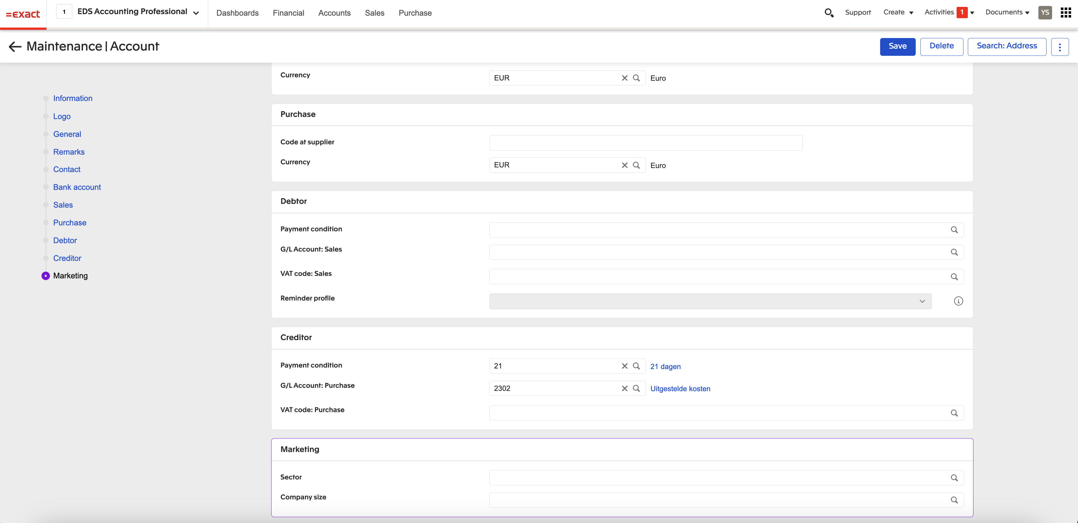
One striking innovation in the design of Exact Online is how forms are handled. Yael: “We paid a lot of attention to people’s use of forms. We know that the more information that there is on a screen, the higher the likelihood of errors. We have therefore developed a new ‘metro line’ system for forms. It works just like a metro line, with circles to mark the various stops.” The new system ensures a good overview of the entire form. Yael: “You can see at a glance which parts of the form have already been filled in and where information is still needed. From the overview, it is easy to navigate to the relevant sections. You always add information from a single column. This improves your focus, reducing the likelihood of mistakes.”
Increased productivity and satisfied users
User-friendliness is one of the four principles guiding Exact’s software development. Yael: “People believe business software should be just as accessible as the consumer solutions with which they are familiar. We want Exact to meet these expectations. Making software more intuitive reduces the learning curve and improves efficiency. Increased productivity and satisfied users, that’s what we’re all about.”
Rollout of new interface during Exact Live
Exact Online’s new interface will be presented during the annual Exact Live customer event on 19 June. Yael: “After that we will start rolling it out in stages. With this new user interface, we are introducing a fresh new look for Exact Online, but also creating a unified experience for all Exact touchpoints such as the use on laptops and mobile phones. That makes it easier than ever for our customers to navigate and work with Exact’s ecosystem.”


